Introduction
Having a firm grasp of how video scopes work is crucial to critically evaluating what youʼve captured. Whereas an uncalibrated monitor can deceive your eyes, video scopes will always reveal the truth, whether thatʼs in terms of contrast, hue or saturation. Hereʼs everything you need to know to get to grips with these invaluable tools.
RGB Additive Color Model Overview
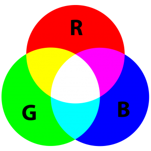
There are two color models we use to describe the interaction of colors around us; additive and subtractive. The subtractive color model is used to describe colors that originate from light reflecting off a pigmented surface e.g. printed photographs, books, paints, clothes. The primary colors in this model are Yellow, Magenta and Cyan. When you mix these primaries, you get the secondary colors, Red, Green and Blue. When you mix all of them together, you get black.
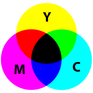
In the world of digital image creation, whether still or moving, we rely on seeing these images on screens like TVs, computers and phones. Anything that emits its own light falls in to the additive color model, which is the exact opposite of the subtractive model. So Red, Green and Blue are our primaries and Cyan, Magenta and Yellow are our secondaries. Most importantly of all, when we mix all these colors together, we get white light.
Histogram
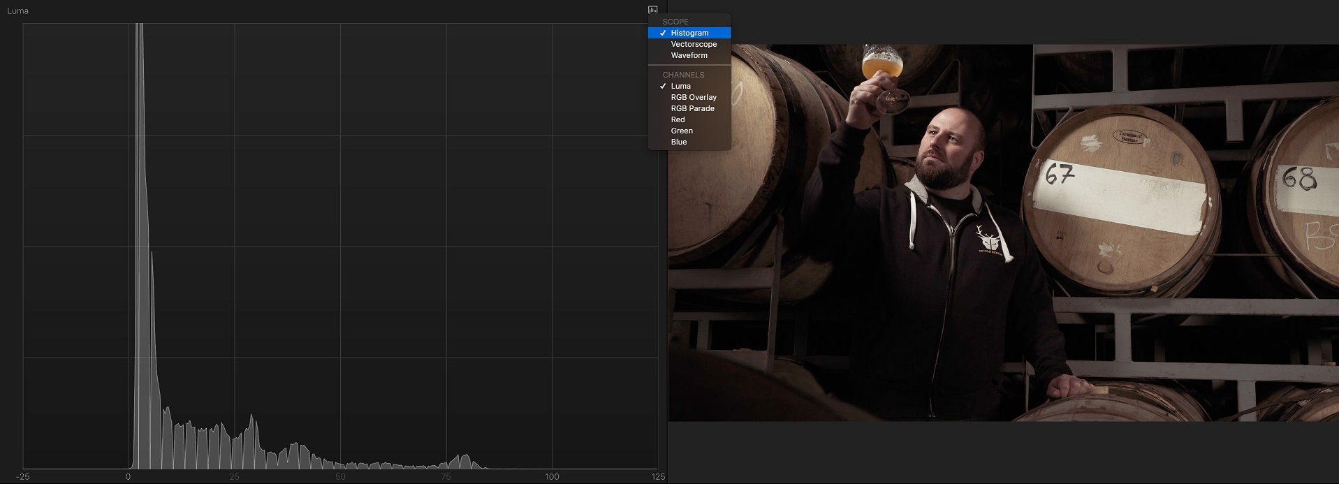 Ignoring color for a moment, and just focusing on contrast, the histogramʼs job is to show you the spread of luminance in your image. It looks across your entire image, counts all the black pixels, and traces them at the far left of the graph. It then finds all the pixels that are one shade brighter and stacks them next. It does this for all the pixels in your image, based on their relative brightness, until it has plotted all of them from left (black) to right (white) on the graph. It doesnʼt matter where these pixels were in your original image and, as such, this makes a Histogram quite an abstract thing to comprehend. Generally speaking, when traces stack up broadly across the whole range, then you have a well lit scene with a wide dynamic range.
Luma Waveform Monitor
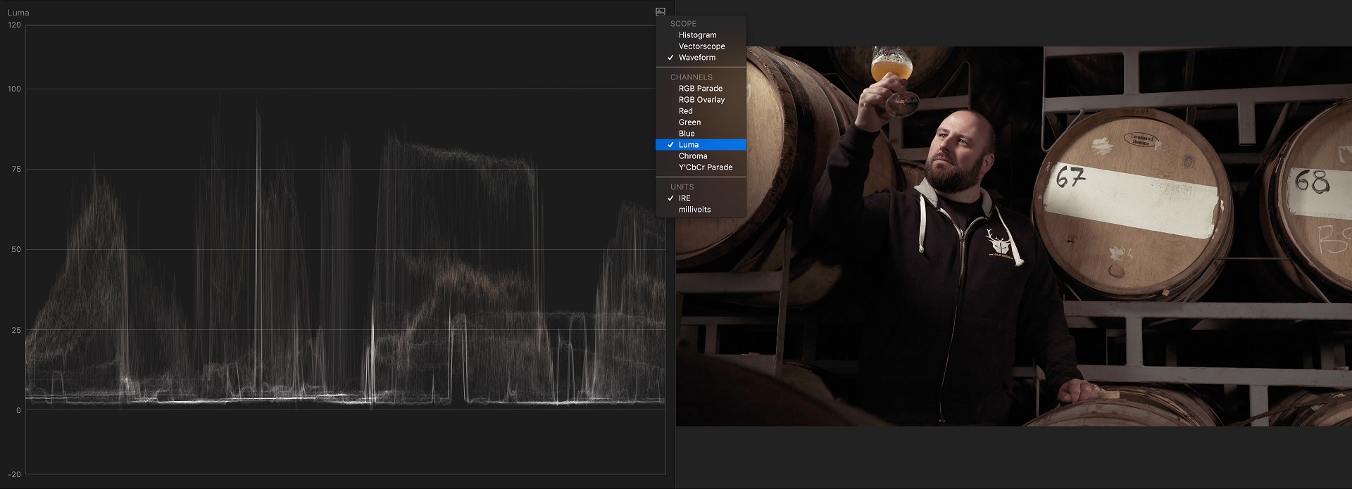
A much better way, in my opinion, to view the spread of contrast in your image, is to use a Waveform monitor. This does broadly the same thing, but with two key differences. Firstly, black is at the bottom (rather than left) and white is at the top (rather than right). Secondly, the traces that represent the luminance values of the pixels in your image are plotted top to bottom based on their brightness, but crucially are plotted left to right in the same place as they appear in your image. As such, it is much easier to discern individual objects or parts of your scene within the scope and then quickly judge how bright it is based on itʼs height on the graph. Again, generally speaking, if you have traces spreading across the full height of the Waveform Monitor, then you have a well lit scene with a wide dynamic range.
The scale up the left hand side in this image is an IRE scale, which was devised by the Institute of Radio Engineers. It is a simplification of the more traditional millivolts scale, which was the norm back in the days of CRT TVs. 0 IRE (0 mv) represents black and 100 IRE represents broadcast white (700mv). The scale goes beyond these points because not all content is destined for broadcast and, therefore, not everyone is encumbered by its transmission limitations. So, for example, anything destined to be played on a computer monitor could go all the way up to 109 IRE, called super white. In DaVinci Resolve, the scale has 0 at the bottom (black) and 1023 at the top (white). This scale is based on the number of steps (shades of grey) that a 10bit (the standard for broadcast) signal can have.
RGB Overlay Waveform Monitor
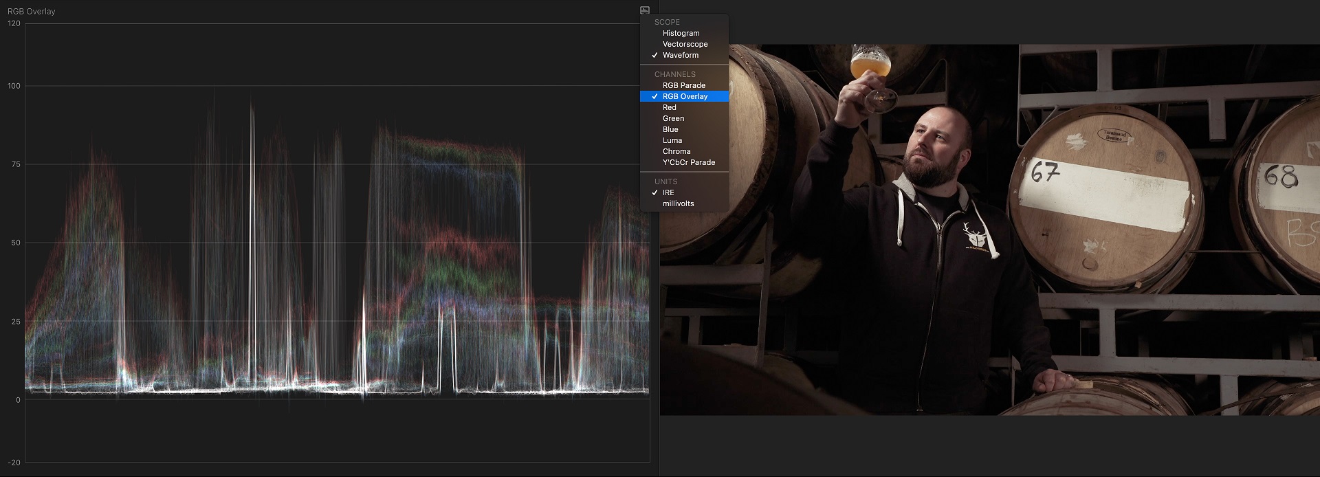
This does the same as the Luma Waveform Monitor but shows each of the three primary color channels separately, one on top of the other, in the scope. This makes it easier to pick out certain objects and then tell whether or not there is a color cast present or not. Most software will actually make the traces go white, when all three channels are perfectly aligned on top of each other. This makes life very easy for you when you are trying to make sure black, white or grey objects are free of unwanted color casts.
RGB Parade
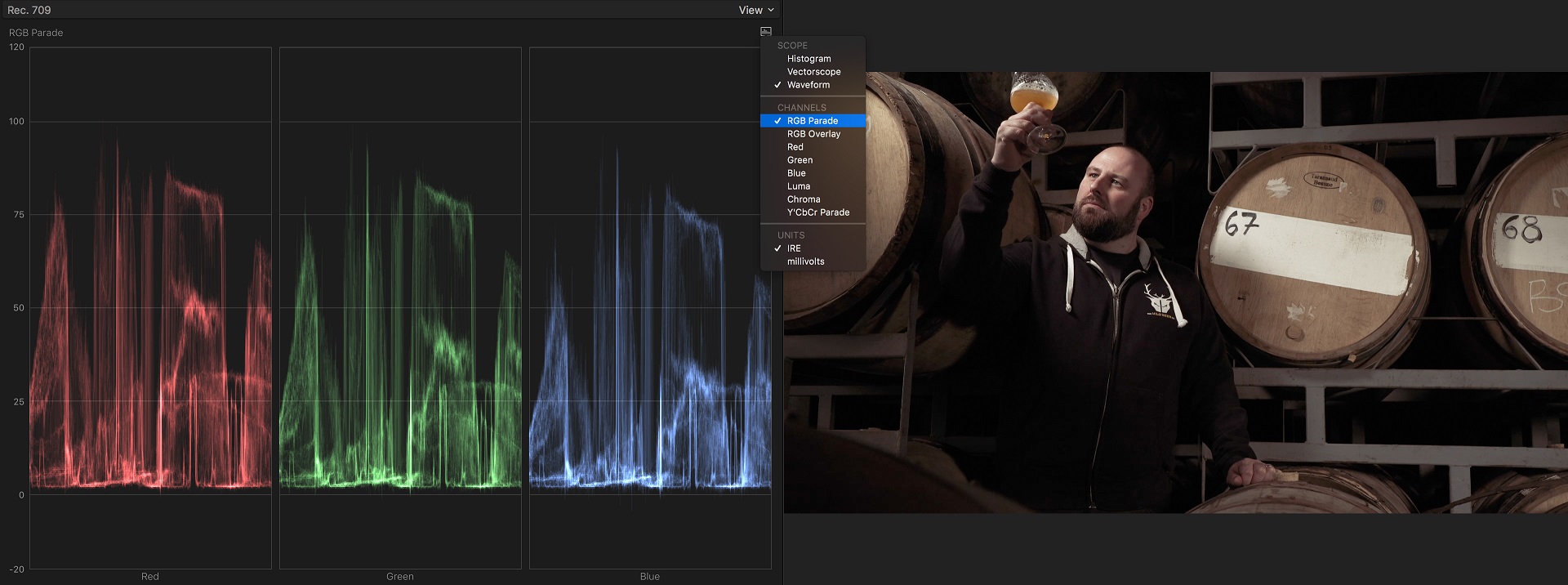
The RGB Parade is the same as the RGB Overlay WFM, except it displays the channels side by side, rather than on top of each other.
If you have a black, white or grey object in your image, it should appear level (the same IRE) in each of the channels. If you had an object that was meant to be black but the traces for this object appeared higher in the blue channel, for example, then youʼd know that you had a blue color cast to your image. Remember, the higher it is, the brighter it is. So in this case, as the blue channel is higher, it means the blue is more visible. If the blue channel was lower, you would have a yellow cast in your image, as minus blue is yellow in RGB. In other words, yellow is opposite blue on the color wheel, so as you move away from blue, you get more yellow in your image.
This can be confusing for people who arenʼt familiar with color wheels and the relationship between hues, like complimentary colors for example. It is for this reason that Apple chose to use a linear color “bar” in FCP X, with plus and minus indicators on it. Want less blue, simply move your shadows, mid-tones or highlights control to blue, and drag down (minus). You therefore donʼt need to know that you are in fact simply moving towards yellow, you just need to know what hue you want to target and move down (-) for less or move up (+) for more.
Vectorscope
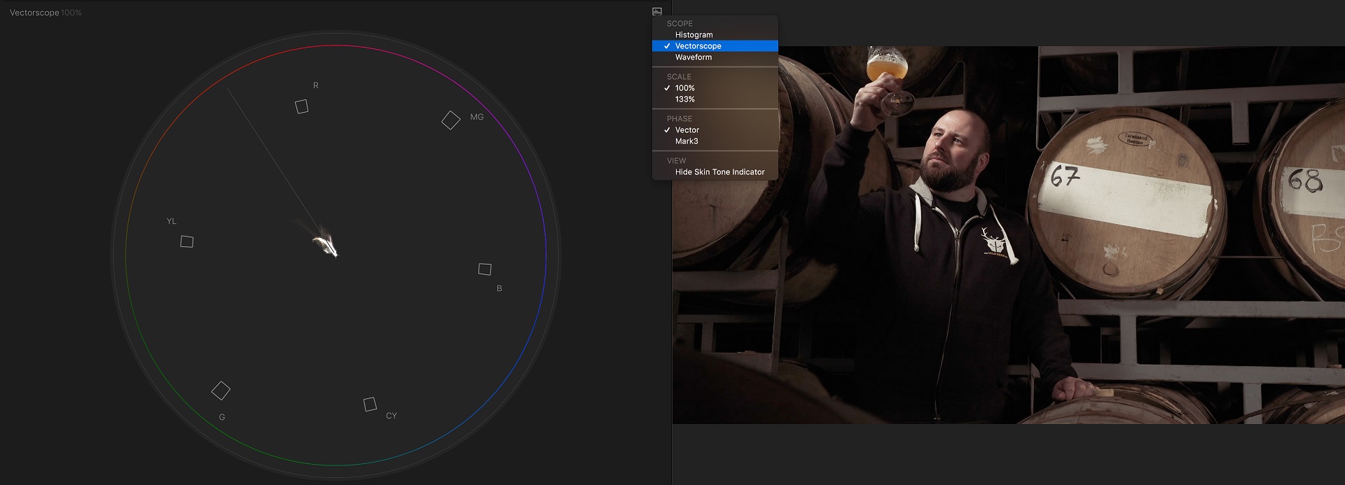
The most useful of all scopes, this one shows a color wheel with the hue and saturation values of your pixels plotted on it. The centre represents 0% saturation and the outer edge represents 100% saturation. As very often you donʼt have (or want) objects to be more than 50% saturated, most software lets you zoom in 2 x, essentially making the outer edge become a 50% boundary, rather than 100%. Flesh tone lines are also often shown on a Vectorscope, in order to represent where human skin should be. This is consistent among all races, as the hue is based on the color of hemoglobin, which is the same in all of us. I love to have this scope up in FCP X (Cmd-7) whilst skimming through my sequence, as I can quickly see where hues are falling and thereby identify any rogue, unbalanced parts of my film.
So there you have it, everything you need to know about scopes. Be warned, though, that knowing what they do is a far cry from being able to “read” them instinctively and adjust your image quickly. This takes time and practice, but the rewards are great, as you will be able to identify problems and fix them without relying on your constantly shifting vision (our brains are sometimes too clever for their own good, but thatʼs a story for another time) or a constantly fluctuating, badly calibrated monitor.